Logo Visions
Four distinct creative directions for the Terra Clay identity. Each captures the brand from a different perspective.
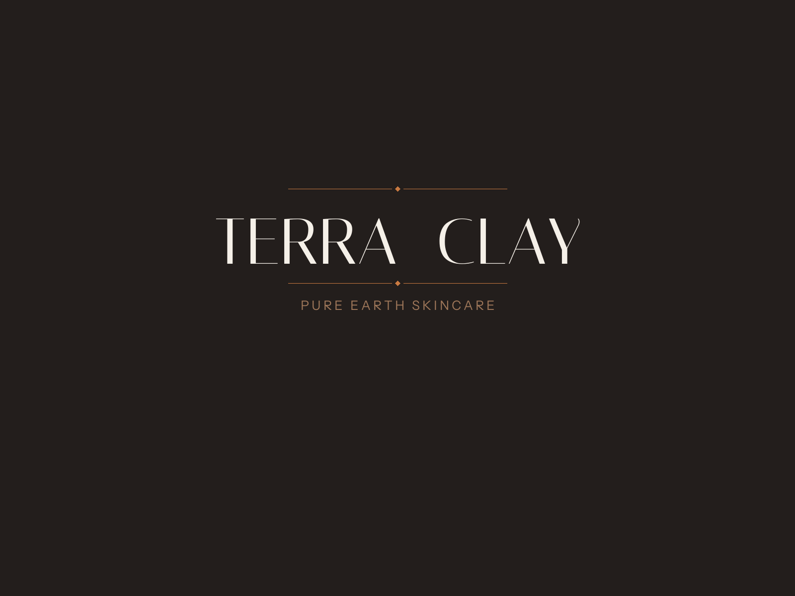
Heritage Serif
Classic luxury wordmark framed by fine ornamental rules with diamond accents. Pure typography, no icon — the name is the mark. Conveys authority, heritage, and timeless refinement.
Italic-leaning Italiana serif with generous letter spacing creates an editorial, high-fashion presence.
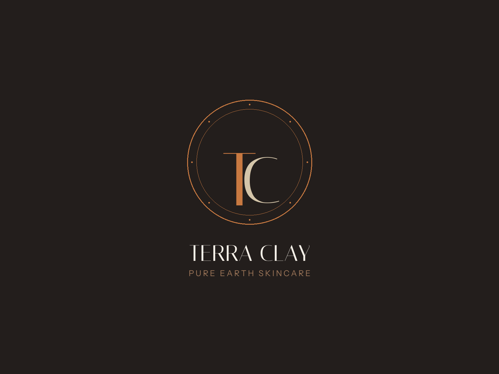
Monogram Crest
Interlocking T and C within a double-circle seal. The terracotta T anchors against the softer sand C, creating depth and movement. Eight cardinal dots add precision.
Works as both a standalone symbol and a full lockup with the wordmark below.
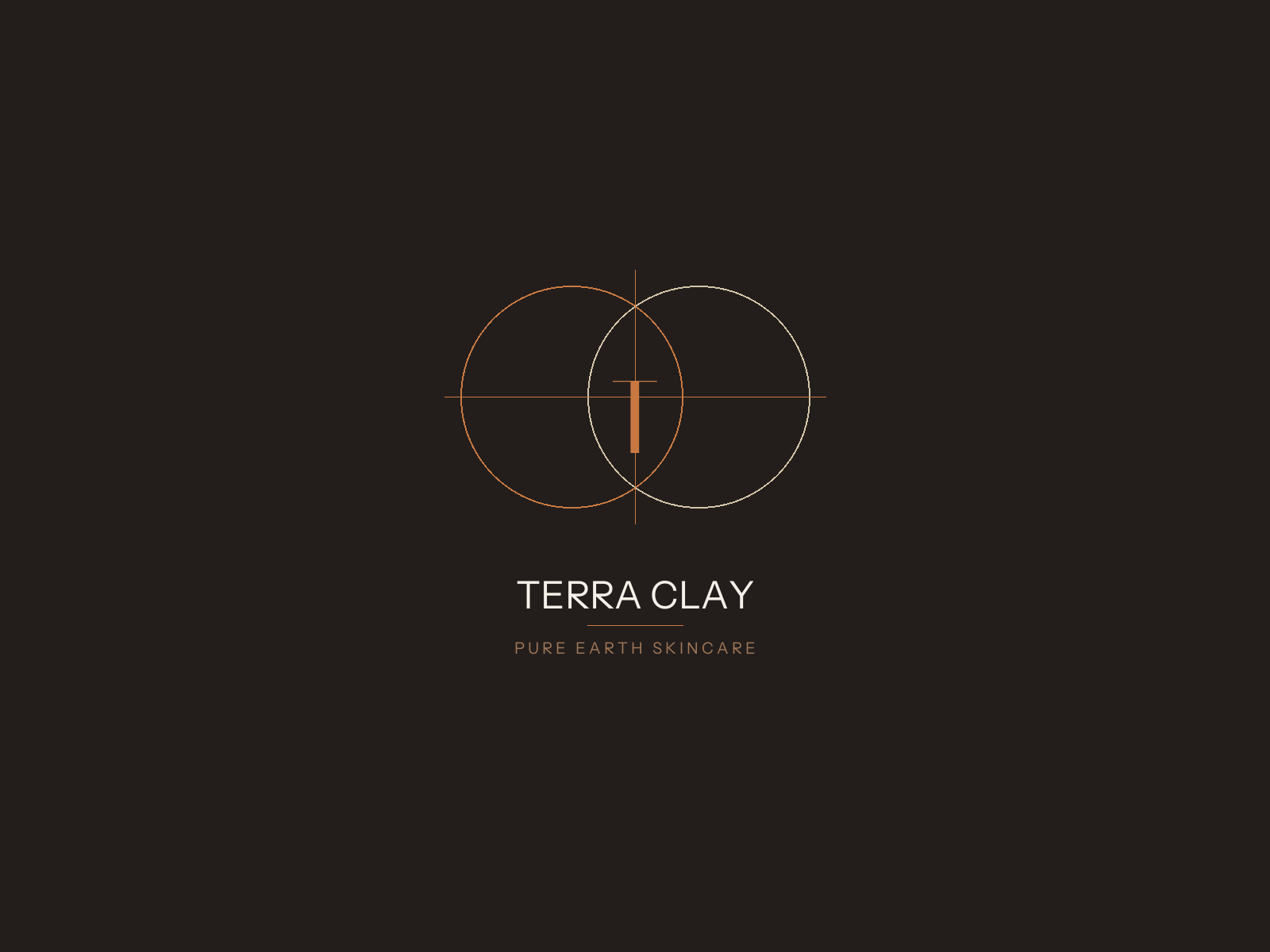
Geometric Mark
Two overlapping circles form a vesica piscis — an ancient symbol of creation and duality. The intersection holds the letter T at the meeting point of earth and skin.
Clean sans-serif wordmark below keeps it contemporary. Crosshair lines suggest precision and science.
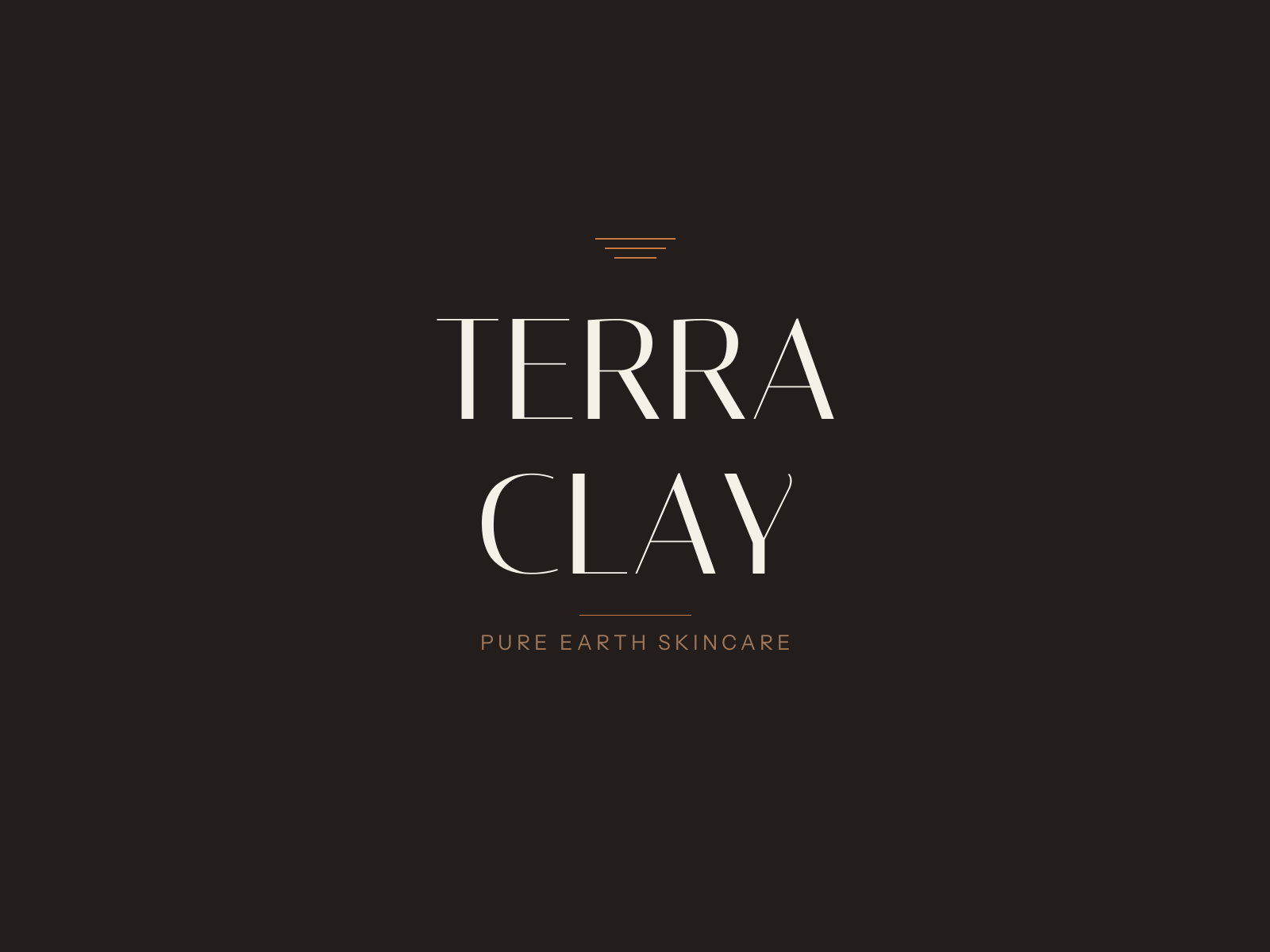
Architectural Stack
Bold vertical typographic composition. Three descending earth-layer lines crown the name. TERRA over CLAY creates a monumental presence — confident, minimal, and unmistakable.
No icon needed. The typography is the architecture.